My 15 learnings since working on a mobile app
For the last four months, I have been working with an amazing team on the app of an iconic Australian retailer, Target. I have been learning many things since we started, so I decided to write about these learnings.
The learnings I am about to share are all about the tool and technique I use to design the app; I deliberately didn’t share any confidential information.
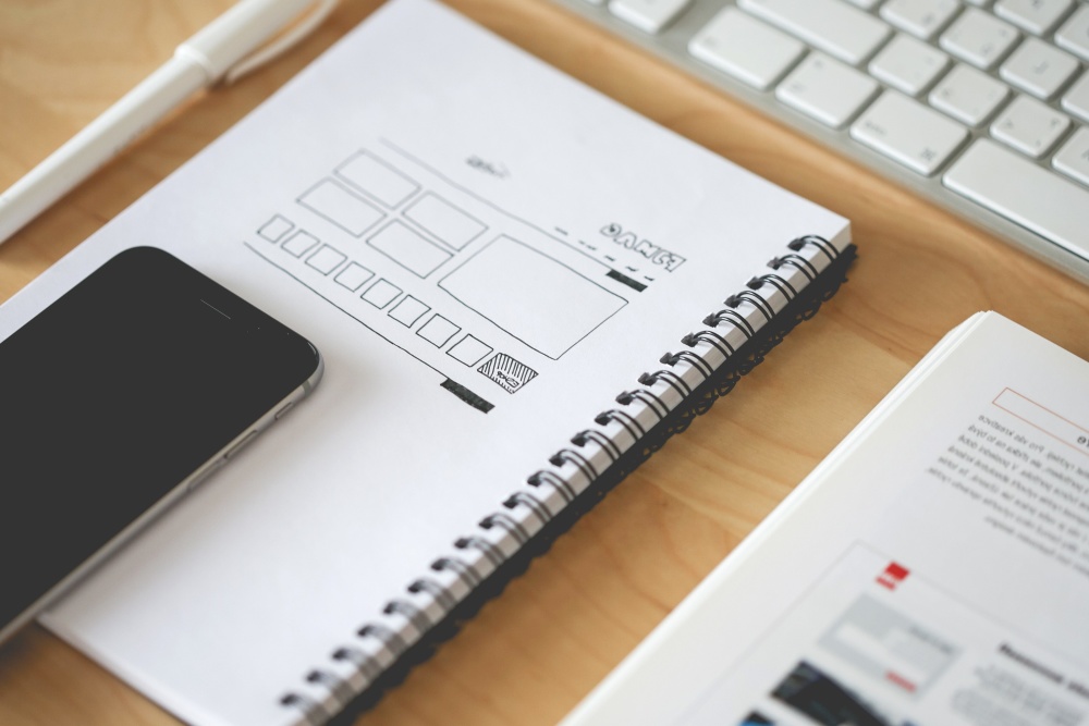
#1 Organisation of my Sketch files
To manage my Sketch files, I created a master folder per platform (one for iOS and one for Android), within each master folder, I created a subfolder for each area of the app, for example, the home screen or the store locator. It took me a few days to discover the best way to organise my files.
#2 In Zeplin, create one project per platform
An iOS developer and an Android developer need different formats when exporting visual assets such as icons. So in Zeplin, I created one folder for iOS and one folder for Android, in each folder I used dividers to separate the different areas of the app. Using this organisation makes things easy when using Zeplin in a big company where many designers have multiple projects.
#3 Avoid custom navigation
In the early days, I made a mistake, I customised the design of the navigation instead of using native elements, we quickly realised that it would cost too much in engineering time. Using native elements is the way to go, there is no need to reinvent the wheel. Not every apps use that strategy, I have spotted popular apps having a custom design for their navigation.
#4 On Android, a drawer is not always the way to go
After checking the material design guideline, I have learnt that I can use a bottom navigation on Android if I have less than five menu items. I was wary of using bottom navigation on Android, but I quickly learnt after a few usability testing sessions that it wasn’t much of an issue.
#5 Animations with InVision Studio
Animating with InVision Studio is fun and very simple, but it is not as flexible as Lottie. I found myself needing more control over the animations when using InVision Studio. Using InVision Studio to create animations is so fast, I am confident that the tool will deliver more animations options in the future.
#6 Prototype for augmented reality with Torch
I explored Torch to prototype for augmented reality; it is a fantastic tool that quickly gave me what I needed without involving an engineer, in 10 minutes I created something from scratch without any difficulties. What makes Torch amazing is the integration with Sketchfab, the largest platform of 3D content on the web. You can upload your 3D model on Sketchfab and retrieve it on Torch in no time.
#7 Regularly preview the design on a physical phone
I use Sketch Mirror to render every screen I design on at least two physical phones. Rendering the screen on the actual phone brings you much closer to reality, the render of fonts and colours is often nicer than on my desktop screen, thanks to the high quality screens of some phones. I also use the function “Fix position when scrolling” to interact with the design when using Sketch Mirror.
#8 Design for a least three resolutions
To understand how the design will render on different phones, I take the time to design the same screen for three different phones; iPhone SE, iPhone XS and Pixel 2. Using three different phones seems to be the best approach considering the time I have to produce the visual assets. I often start from a larger screen and then work my way toward the iPhone SE. I made that decision because the majority of our customers have big mobile phones.
#9 Mr Tappy is a must have for user testing
Capturing the gesture, screen and comments from the user have never been so easy with Mr Tappy. I believe that Mr Tappy is essential for designers working on an app. I run usability testing sessions with customers every month and share the most interesting raw footages with the product team.
#10 I start the day by checking the latest reviews
Every morning, I start the day by checking the latest customer reviews on both app stores. To make it easy, we have connected the stream of reviews into Slack; so everytime a customer post a review we are aware of it. The system helps us keep the pulse on our customer base.
#11 An app is more personal than a website
I learnt that designing an app needs much more efforts when it comes to personalisation. For example, the way we use notifications required a thoughtful strategy as it can quickly annoy some users resulting in them deleting the app. Another example is the way we leverage personal information such as the location, we learned to make good use of it and make sure we offer an outstanding experience even if the user doesn’t want to share her location.
#12 Regularly play with a platform I don’t use
I have been an iPhone user for years and for that reason I have tons of bias. This can be detrimental when designing a mobile app, so I often grab an Android phone from our amazing testing engineer and play around with some apps, I try to do this on a weekly basis. It gives me additional perspectives about the Android platform and complements my understanding of the Google Material Design guideline.
#13 Show the design on a phone, avoid the Tv as much as you can
I always seek feedback from the product team and the UX team, during these feedback sessions I noticed that using a phone instead of a Tv Screen when showing my design help those making the critique. Using a Tv Screen is convenient for large group of stakeholders, but it is often disconnected from the actual render, see learning #7.
#14 API are keys
I learned that working on an app using web views requires APIs to be effective. I quickly realised that understanding the API strategy is critical when designing the user experience of a mobile app. Regularly talking to the engineers in different teams really help to see the bigger picture.
#15 Try a few new apps every month
To keep my creative mind in action, I download a couple of new apps every month. It keeps me in touch with trends and continually sparks new ideas.
How would you rate this post?